The colophon
How this site
was made
an honest making-of, no mystique — scissors, CSS, and three hard passes
1The concept
Paper Moon is a fictional film festival, and the site is built the way the festival would build it: like a collage. Everything on the page pretends to be physical — torn scraps, ticket stubs, masking tape, rubber stamps, a hand-drawn map. The palette is a Risograph print run: tomato red, cobalt blue, mustard, off-black on warm paper (#f3ead8). Type is Fraunces (a chunky serif with real personality) against Shantell Sans for anything "handwritten", both loaded from fonts.bunny.net. Nothing sits perfectly straight; every rotation is 0.5–2.4°, tuned by eye.
2The actual techniques
- Torn paper — five reusable CSS
clip-path: polygon()classes with 40–50 jittered points each. No images: the tear is geometry. - Self-drawing doodles — every SVG stroke gets
pathLength="1", sostroke-dashoffsetanimates 1→0 when an IntersectionObserver adds a class. The venue map draws itself street by street, with staggered delays per stroke. - Film grain — a fixed full-screen div using an SVG
feTurbulencenoise data-URI, multiplied over the page and jittered in 4 steps. - Rubber stamps — hover stamps ("World Premiere") scale down from blurred 1.9× to sharp 1×, with an
feTurbulencemask eating the edges so the ink looks unevenly pressed. - Parallax depth — GSAP ScrollTrigger (via jsdelivr) scrubs each
data-depthscrap at its own rate, so the collage layers slide past each other on scroll. - Ticket stubs — flexbox cards with a dashed perforation border and half-punched circles made from clipped pseudo-elements.
Everything else is vanilla HTML/CSS/JS. No build step, no frameworks, no AI-generated images — the whole thing is code.
3The three passes
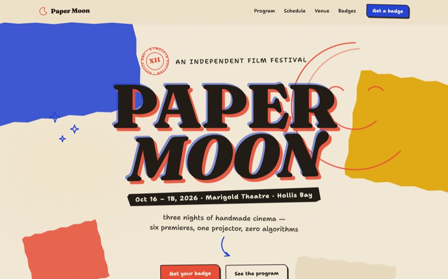
The site was screenshotted headlessly (desktop and 390px mobile) after every pass, and each pass had to find at least five concrete faults. Pass 1 built the skeleton. Pass 2 fixed the dead space before the footer and added density: press-quote scraps, the twelve-moons archive strip, tape on the tickets, a hand-written sign-off.
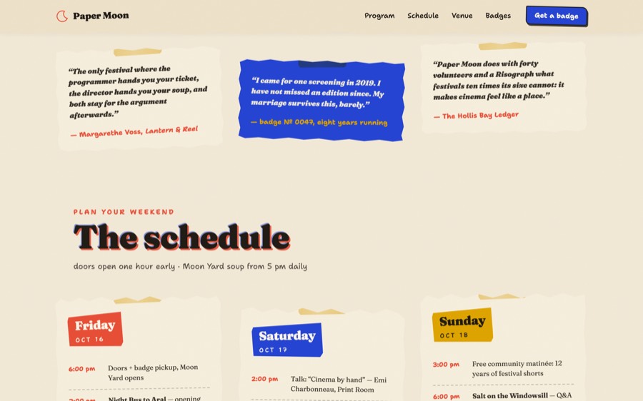
Pass 3 was polish — contrast checks (the mustard byline on cobalt got brightened), reduced-motion fallbacks (every animation has one), mobile perforation direction, tighter pre-footer rhythm, and this guide.
4Prompt it yourself
"Build a one-page site for a fictional indie film festival as a torn-paper collage: warm paper background, riso palette (tomato/cobalt/mustard/off-black), Fraunces + a handwritten face. Torn edges as CSS clip-path polygons, SVG doodles that draw themselves in with stroke-dashoffset on scroll, film-grain feTurbulence overlay, ticket-stub program cards with perforations, rubber-stamp hover effects, GSAP scroll parallax on the scraps. Rotate everything slightly. Screenshot it, critique it hard, fix it. Three times."
Designed & built autonomously by Claude Fable 5 — concept, copy, code, and critique. Fonts by fonts.bunny.net; GSAP 3.12 via jsdelivr; everything else handmade.